
Finally, a new website for The Meeting House
Special Note
I am no longer affiliated with nor do I do any work or volunteering for The Meeting House. My role in this specific project concluded in June of 2021, and I’ve had zero involvement with the change in direction the website has taken as well as any of the changes that have been made.
While I am proud of this project and the work I accomplished , this case study is not an endorsement of The Meeting House church, its leadership, and its policies.
It was 2019 and The Meeting House website wasn’t mobile friendly—and that’s just the tip of the iceberg. After years of no development and zero innovation it was time to tear it all down and start from scratch.
A literal blank slate, a new brand, and a passionate team ready to create something special. Let’s do this.

In the beginning
Prior to beginning work on the website, I had the privilege of co-leading the rebranding efforts.
The lead designer was Marcelo Hong (Leo Burnett), in partnership with Ben Weeks who served as the creative and branding consultant. Working with this duo has been one of the highlights of my career.
I share this because the new brand and the process involved were critical to the new website.
No designer, strategist, developer, or writer would be able to do their job effectively without the new brand guidelines and brand strategy framework. Achieving clarity and team unity on this front helped keep the project on track.
“People will forget what you said, people will forget what you did, but people will never forget how you made them feel.”
~ Maya Angelou
Part 1: A Brief, Inspiration, and Strategy
That quote from Maya Angelou became a rallying cry for us. Content, function, and workload aside, we began our project with this foundational principle: we care how people feel when they interact with our website.
After meeting with key stakeholders and senior leadership, we put together a one page creative brief that helped us establish a set of realistic goals while also leaving space for interpretation, exploration, and discovery.
We were lucky enough to consult with Norma Penner MacDonald (Fjord) who reviewed our brand, conducted both a comparative and competitive landscape analysis, and outlined a pathway to help us establish our approach and strategy.
This work helped us land two cornerstone ideas:
We identified our primary audience as the spiritually curious: people who would report as none on a survey when asked about faith or religion. They were generally open to spirituality and exploring faith, but had no prior church or religious experience. We realized that many church websites were designed to serve people who were already part of the church. Our vision called us to something different. We didn’t want to ostracize our existing audience, but instead of building a website for them, we wanted to build a website they could use to join on mission and participate in our vision.
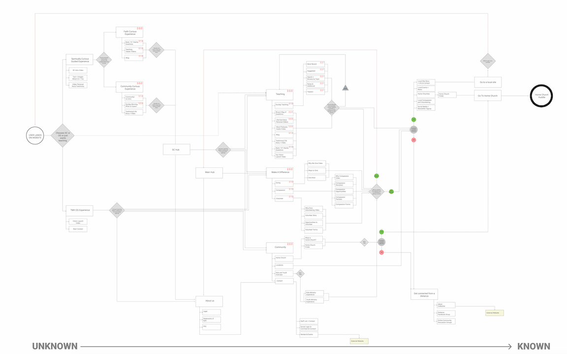
A heuristic evaluation of our content, key message, and offerings, helped us map out a very rough overview of user journey and understand the role of our website in our primary audience’s spiritual journey. We didn’t want to overwhelm users and leave them to figure this out on their own; we opted for a narrow journey of many small steps we could take together.
One specific afternoon session with Norma felt so inspiring and productive that I still have the photos of what would become the skeleton of this new website.
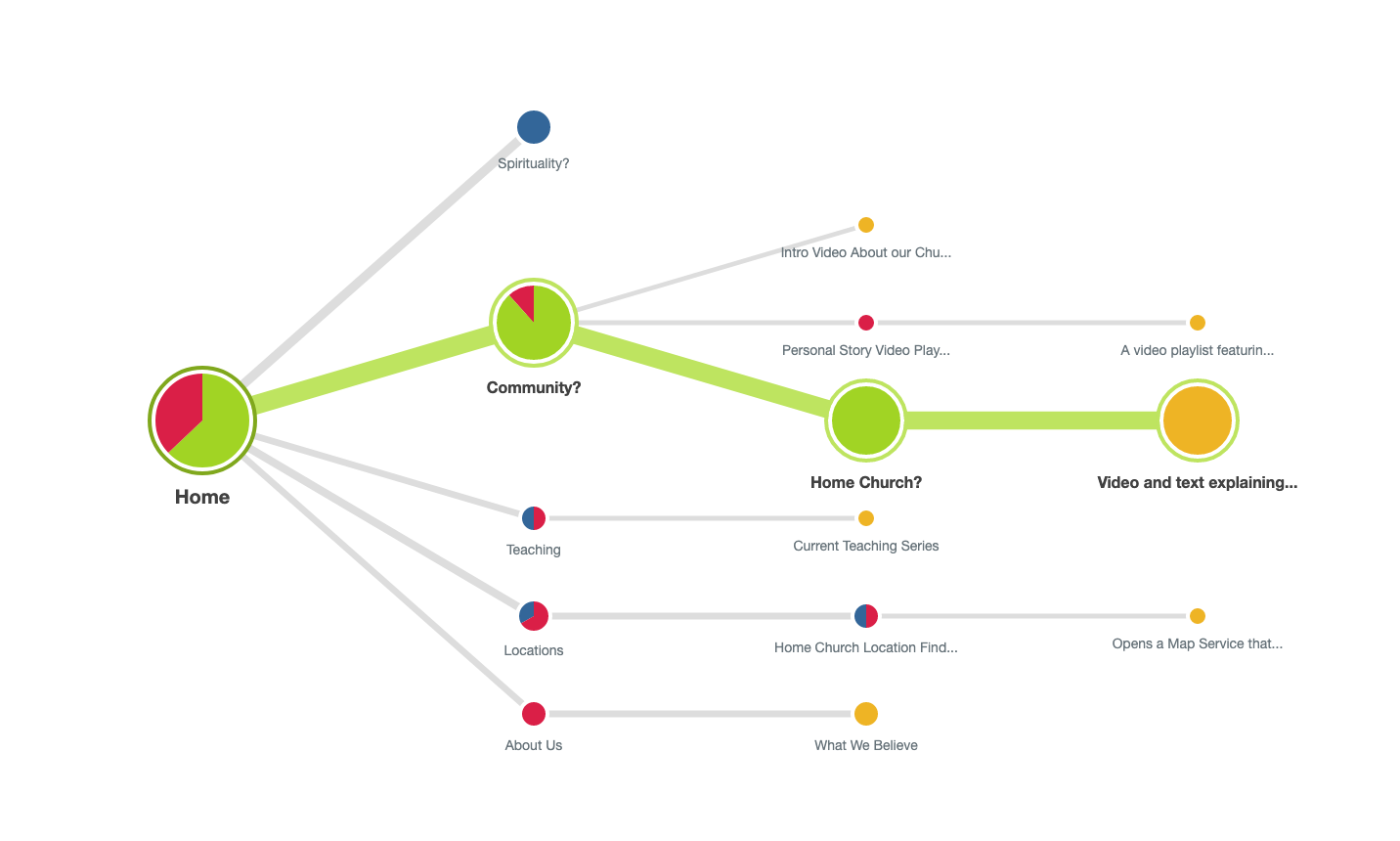
User flow for spiritually curious users for the new Meeting House website.
User flow for existing community for the new Meeting House website.
Part 2: Guiding Principles, UX, and User Research
We created 5 guiding principles to serve as a compass for this project. Any and all decisions would be measured against these principles. We even printed them off on large sheets of paper and taped them all over the office as a constant reminder.
I put together a “website bible of sorts” that included the following:
our north star—the single conviction we were following and aligning all things to;
website objective;
key behaviour transformation;
the philosophy behind our website;
our strategy and approach to content.
Once this was established, we moved onto more UX work and completed the following:
user personas (empathy mapping, AEIOU environment assessment, jobs-to-be-done framework);
user journey flows;
content analysis;
site map;
navigation;
main pages.
During this stage I was also focusing my efforts on audience research that would inform our user flows, site map, and navigation. I was able to connect with a dozen users who identified as spiritually curious, across a wide range of segments, as well as a few staff and church members, and used OptimalSort to carry out UX research, including:
open card sort;
closed card sort;
treejack testing.
This was a critical part of our process. We tested a lot of assumptions, made a lot of mistakes, and changed direction on a hundred things—but we were actually doing it! We were making a website with spiritually curious users at the centre.
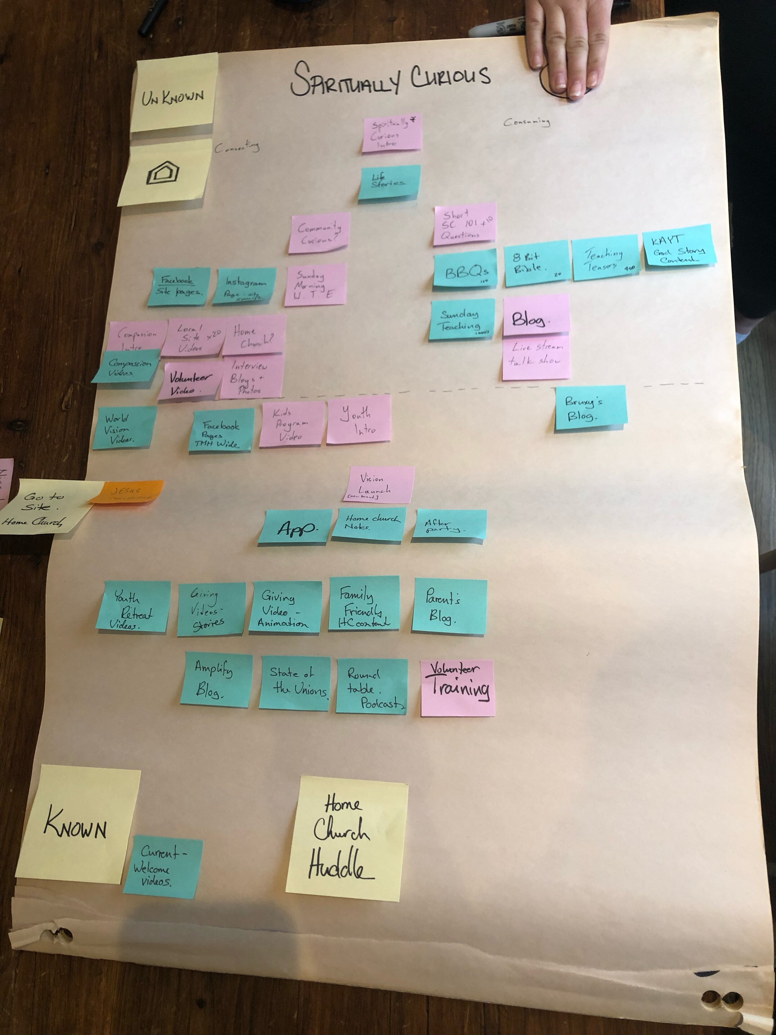
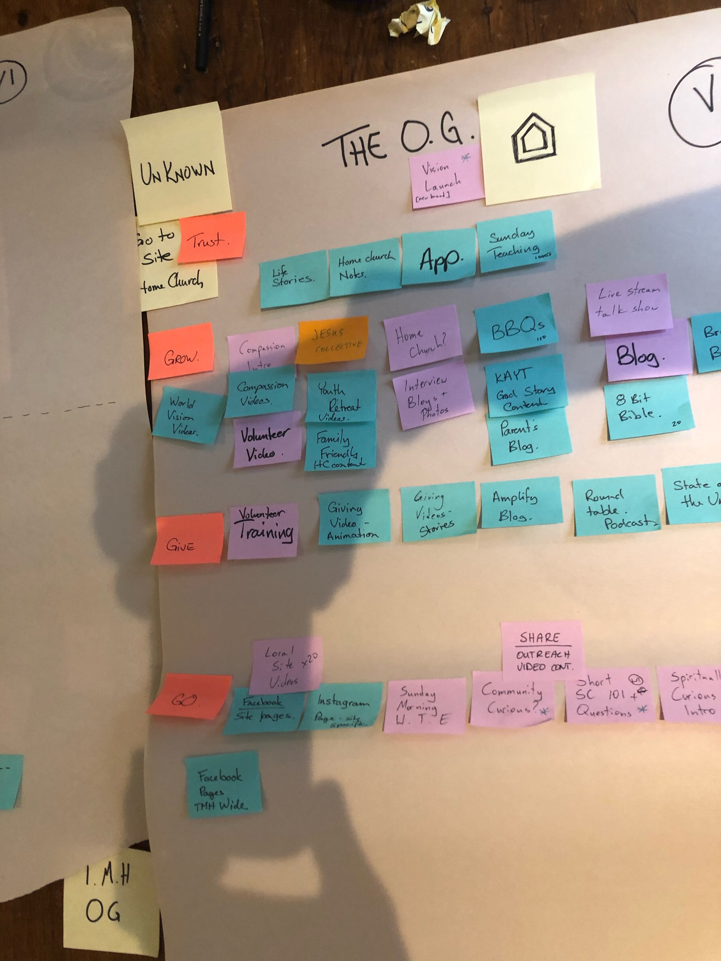
I pulled together some of my favourite screen shots and photos below—I’m so glad we documented this process.
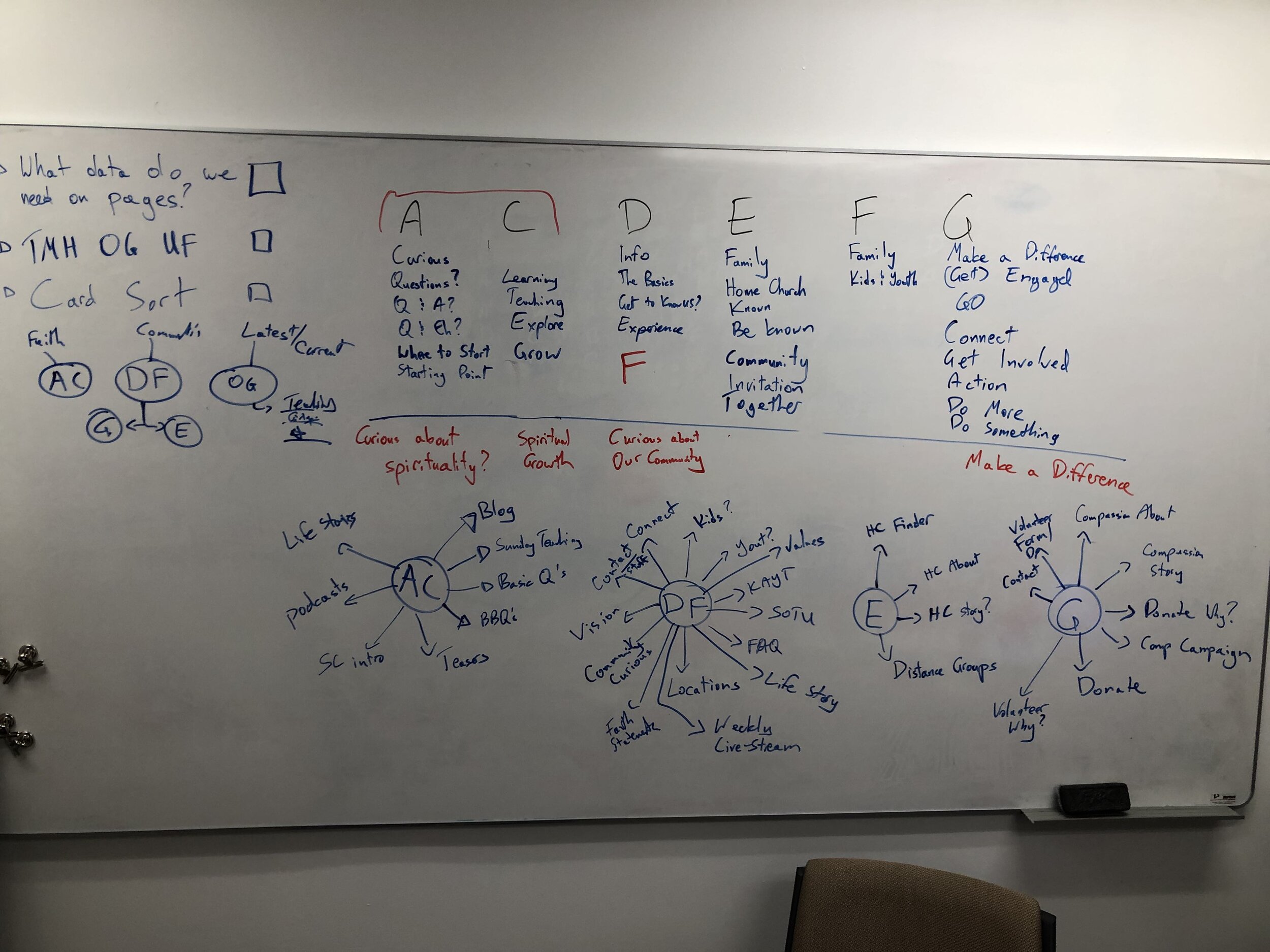
Main navigation exploration session.

Results from closed card sort user testing.
Content mapping.

Results from open card sort user testing.
Results from treejack testing.
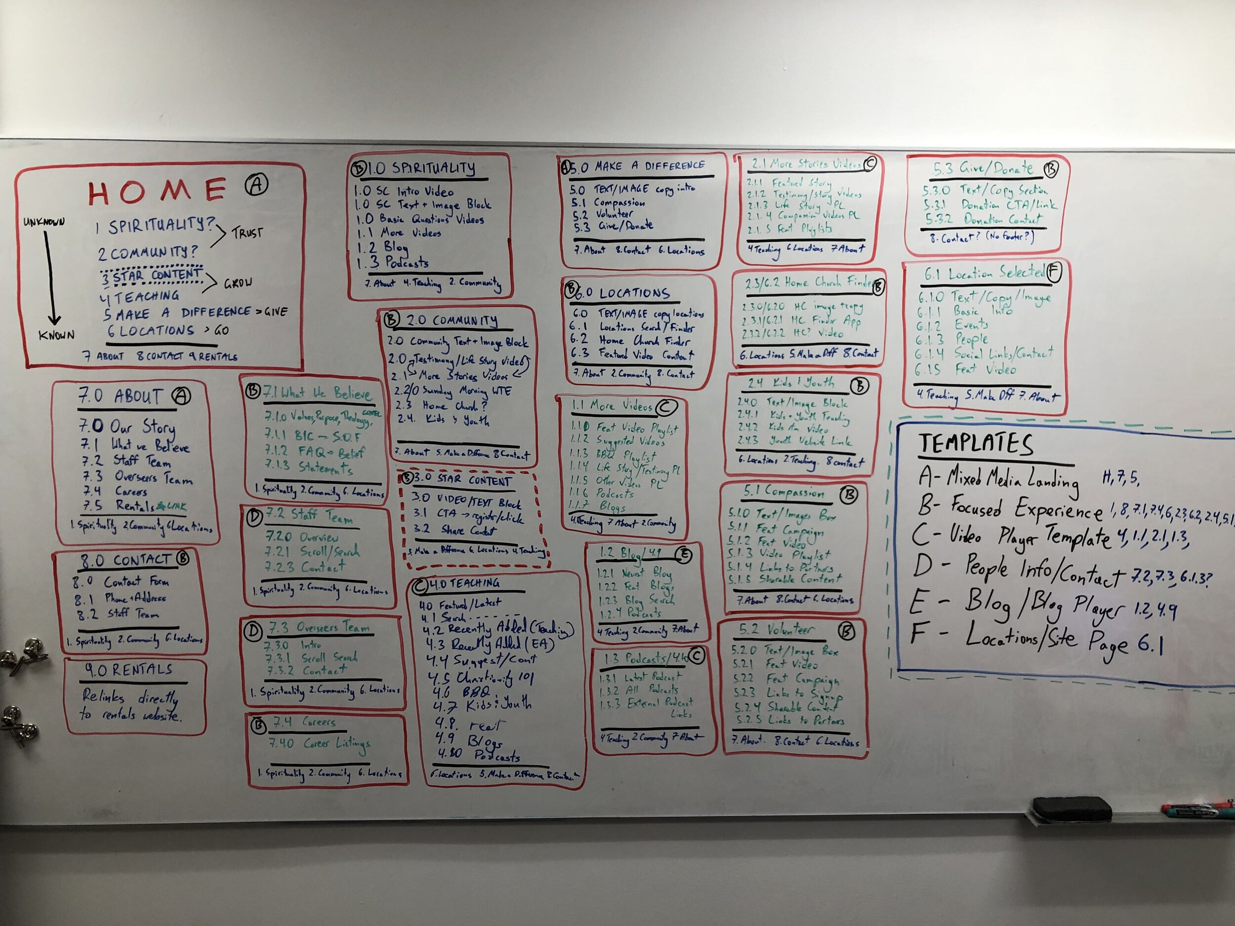
By this point we had refined our user flow and created this most beautiful thing on Figma. 👇
Refined user flow for the new Meeting House website.
We also went to town with some extremely low-fi wireframes on Figma and linked all the pages together to try and simulate real-time navigation. 💡
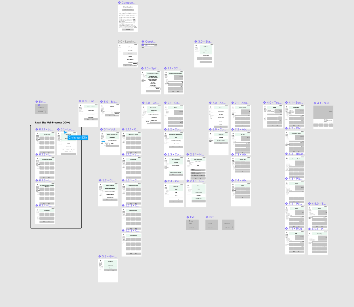
Lo-fi wireframes.
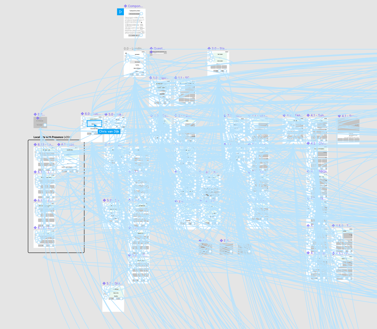
Low-fi wireframes with all the pages and buttons linked for testing.
Part 3: Design, Writing, and User Testing
Once we had completed part 2, we partnered with Phil Goodwin as the lead UX and UI designer for the new website. Phil took our brand guidelines, creative brief, guiding principles, user flows, navigation, and all the other work we had done and got started right away. It was a collaborative process but his expertise and guidance clearly shone through.
At this point I was able to start work on the UX writing. Drawing on our audience personas, UX research, user flows, site map, and guiding principles, I was to draw on a wealth of knowledge to help inform my writing. This also included interviewing other departments and key stakeholders to make sure I captured the right voice when it came to their specific ministry or area.
This was the start of an ever evolving process that continues to this day with weekly updates on the copy, but I am proud to say that I’ve written and edited every single word, button, or call-to-action that appears on The Meeting House website. Of course at this part of the process the writing was a mountain I was just beginning to climb.
During this time I was also conducting ongoing user testing using our Figma designs. I connected with a dozen users from all walks of life who identified as spiritually curious, as well as a few staff and long-time community members to make sure their input was not excluded from the process.
I sent everyone links to the different versions of the designs and copy on Figma, then picked up the phone and called. I was there for every single conversation, making notes and observations as our users swiped, clicked, scrolled, and read through our website mockups.
Once the testing was complete and the designs were refined, I went right back into the writing process—applying the feedback from user testing and working directly in the latest designs on Figma. It’s a critical part of my process to get the copy into the UI as soon as possible to be able to see it, read it, and experience it within the proposed design.


Part 4: New Photos and Videos
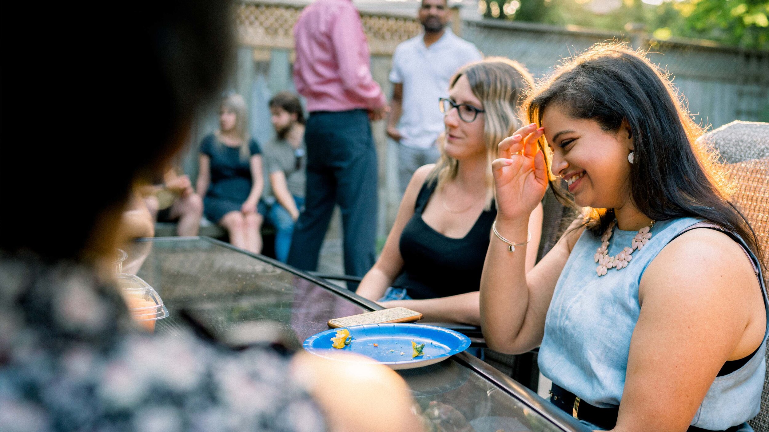
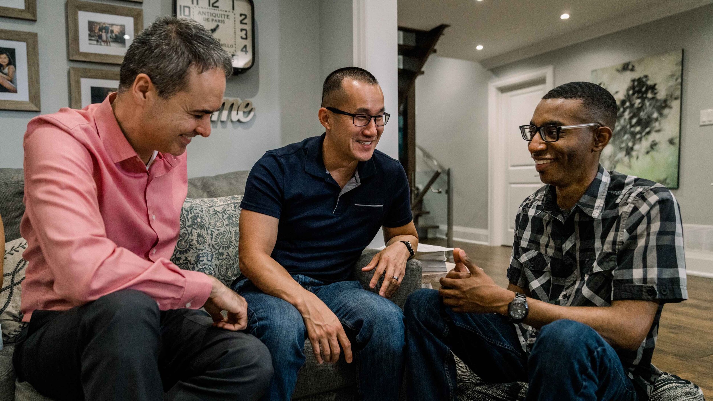
Based on our northern star and guiding principles, I felt very strongly about a goal I positioned to my team: no stock photography. Every single picture on this website would be a real photo, of real people, in real places, that we knew. I’m sick of stock photos that always seem to miss the mark when it comes to capturing the essence of community, relationships, and human interaction. It was an audacious goal, but we had the talent and we were willing to put in the work.
Our lead photographer was Alex Brier, and I was thrilled to work with him in this capacity. I took on the role of art director/producer for this portion and worked with Alex to make sure he fully understood our vision and what we were trying to accomplish. I created the shot list, scouted locations, recruited volunteers, and gave direction on the framing and composition we needed.
During part 1 of this process, we identified some missing videos that were essential to the user journey. Due to time and cost constraints, we prioritized the videos the videos that were most important and produced and in the end completed a staggering total of 10 new videos. I was able to contribute in different capacities as a producer and director.
Part 5: A Minimal Viable Product, GitHub, and Continued Growth
We launched the new website on Saturday November 8, 2019—4 months before COVID hit Canada and our province went into lockdown forcing The Meeting House to move everything online and relying 100% on the new website (talk about timing eh?).
Did we have finished product on launch day—oh hell no. We knew the final product was something we could aspire to, but it would take much longer to develop than we had time. Considering our goals and priorities, it made more sense for us to launch the best website we could, but view it as an MVP.
With all the final UI design work completed and a clear development timeline, we launched knowing it would take us another 1-2 years of constant development to finally deliver what we wanted. During this time we’ve been constantly collecting data and feedback from our audience and using that to create new content, improve existing features, and start developing new things we never knew we needed.
One of my favourite things is that the entire repository for the new Meeting House website is on GitHub for anyone to access and contribute to. It’s been an incredible way to connect with the developers in our extended community and give them an opportunity to become collaborators in this process. To my knowledge, this is the only church website that is being developed in real time by a community of volunteers that spans the globe. That’s truly special.

My Contributions
Team lead on inspiration, ideation, creative exploration, and creative brief
Developed guiding principles and north star
Reporting to senior leadership and key stakeholders
UX research including open card sorting, closed card sorting, tree jack testing, and user testing
Collaborative creative direction
All UX writing
Direction for photography and video
Team lead of development priorities and critical path
Team lead on innovation, improvement, and new development priorities